there all really good but 2 is my favourite


 Senior Member


there all really good but 2 is my favourite
take nothing but pictures, leave nothing but footprints and kill nothing but time
 Dutchgirl
Uhm, when is the verdict in? I cannot wait to see if I'm in our out!
 :...ѕтяαωвєяяу...:
great banners peeps !!!this comp is getting hard !!! well done guys
Member
How can you make banners? I no I don't no much about this site lol.
:...ѕтяαωвєяяу...:
hey shannie welcome to boards...dont know if this is the place to tell you lol but ill go for it anyway. most of us use paint shop pro and you put the settings to 525 by 125 and add the pictures you want and use the rubber to make the picture blend with the others if that makes sense ?. then you can add effects n colour! - hope that helps
Member
Thanks so much for that lol. I'll download it then lol
 starlight starbright
Yeh sameOriginally Posted by Dutchgirl
Fab banners Guys! The competition is hotting up!
 You'll never believe it!
Judge 1
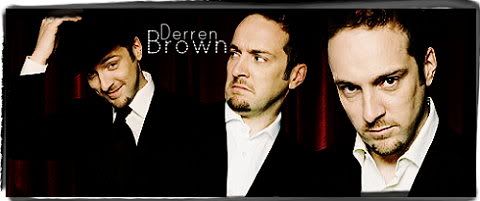
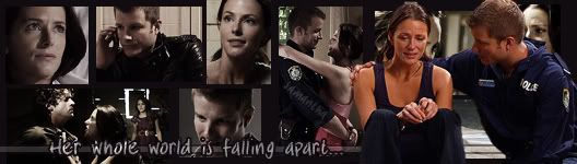
1. Feel it is slightly to light on one side, which for me makes it unbalanced. 7
2. A lot going on in this banner, but for me that holds your interest. 8
3. Bold and straight to the point, really like this one. 9
4. Would have liked to have seen, colour, to bring out the good pictures. 7
5. Its a shame as a lot of work has gone into this banner, but for me it doesn’t stand out from the crowd. 6
Judge 2
1. Like the pictures and the way the banner is presented. 6
2. Not too sure about this one - the little coloured dots seem to take away the focus of the banner. 4
3. Love this one - great touch with the money in the background. 8
4. Really like this one too although the writing could be a bit clearer. 7
5. Although I do like the idea of the money being used in the banner I think this was a bit over kill. 5
Judge 3
1. Mottling hurts my eyes a bit, but great effort. 6
2. Slightly busy for my liking and writing not equally spaced. 5
3. Very good but not massively creative. 7
4. I like this one, but again, not hugely creative. 7
5. Very creative, good ideas - colours slightly bland, but otherwise, most original out of all of them. 8
Judge 4
1. Slightly normal looking, nothing eye catching. 7
2. Nice effort with the faded background. Not keen on your choice of lettering, but good try, well done. 7
3. I like that you’ve incorporated the names at the top, and the catch phrase. 7
4. Like this and the fact that you haven’t used the normal pictures, you’ve actually taken time to get something a bit different, and used the catch phrase - The Con Is On. 8
5. Not really sure what I think of this one. You’ve got the money sign’s and the catch phrase. You took a risk with the colour, and for me it didn’t work. But really nice effort, 6
Judge 5
1. Nice technique but I cant help feeling its missing that extra something. A bit of text wouldn't have gone a miss. 7
2. Great use of the transparency effect, however I don’t feel that the writing suits the show. 6
3. Superb! I love everything about this! The faded currency signs, the use of the show's catchphrase and the keywords. It is a great piece of banner making! 10
4. Slick and sexy! I like the use of a blue/purple tone, adds an air of sophistication to the banner. However it is missing that special something. 8
5. A brilliant banner! I love the blue tone, the currency signs and the money pictures, however I think you could have merged the hustle and money pictures a bit better. 9
You'll never believe it!
Spoiler:
The person leave this round will be steff. Congratulations on getting this far.
Now we have left in the competition -
Abi, fanatic loves dennis, Crazylea and Dutchgirl.
You new topic will be Disney. Well done for getting this far.
Please have your completed banners to me by, Friday 8pm.
Senior Member
don't know if you already know this but if you want a banner of your own then you need 500 posts
There are currently 1 users browsing this thread. (0 members and 1 guests)
 Posting Permissions

 Reply With Quote